On my comic day, Thursday, I had an opportunity to look at what else is on the shelf. I really didn’t like what I saw.
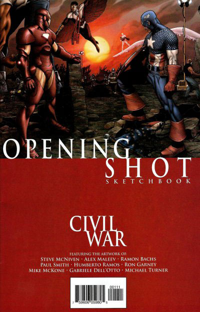
The Marvel Civil War, as I mentioned in another entry, was a mistake. However, the covers that they have chosen are even worse. I am amazed that the artists are not outraged. When I browsed the shelves, I saw book after book of the “Marvel Civil War” covers. These covers are “split screens”. By that, I mean that the bottom is one solid color block–with the words CIVIL WAR written on it. This minimizes the artwork to half a page. This is not impressive and disappointing.
I am amazed by Marvel’s disregard for the importance of the cover artwork.
Vincent J. Murphy says
I have to agree. Also, my comic shop has taken to grouping them all together, which (to me) makes it a lot harder to actually find a specific issue (for example, the X-Factor crossovers were in that section, rather than where I expected).
I don’t mind a nice consistent trade dress for crossovers, but man, Civil War’s is awful. Less space for decent covers, and the ones I’ve seen almost attempt to cram too many characters into half the space, making them look crowdy and muddy. Ick.